Research Point 2

For this research point, I am asked to choose at least three examples from a list of artists, designers and companies that use floral and leaf motifs and research their practice. I am also asked to determine why these motifs are important, dominant or recurring in their work.

Elizabeth Blackadder DBE, RA, RSA, RSW 1931 Scotland

Elizabeth Blackadder is a Scottish painter and printmaker. She is known mainly for her detailed watercolour paintings of cats and flowers, but she has also produced landscapes, townscapes and other still life arrangements portraying decorated tins and boxes with exotic fish, fruit and vegetables. She was the first woman elected to both the Royal Academy and the Royal Scottish Academy.

She considers space between objects carefully, breaking from traditional still life arrangements by composing her subjects on a flattened background, parallel to the picture plane. Most of her backgrounds are plain or a pale colour. This allows the eye to focus on the quality of the subject without distraction from a busy background. Her work takes the essence of a flower or plant, paring it down to simple shapes and colours.

http://www.exploreart.co.uk/images/artWorks/040-270-elizabeth-blackadder-still-life-with-lily-and-flute_1.JPG

http://browseanddarby.co.uk/wp-content/uploads/2011/04/0f48611183864cde926389213396f5fe1.jpg

http://www.leninimports.com/elizabeth_blackadder_gallery_10.jpg

William Morris Britain 1834 – 1896

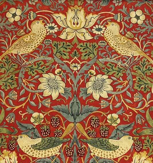
Arguably one of the most well-known textile designers of all time, Morris was also a poet, novelist, translator and social activist. He was a member of the Pre-Raphaelite Brotherhood and a key figure in the Arts & Crafts Movement. Morris took inspiration from plants themselves, and images from 16th century woodcuts, illuminated manuscripts and other textiles using floral imagery. His designs were intended to be subtle evocations, rather than literal copies of nature. You certainly see a degree of classical design in his work, particularly his use of acanthus leaves, which symbolises long and enduring life and immortality in Mediterranean countries. He used blocks of repeating, mirror images, often in bold colour palettes.

http://www.vam.ac.uk/users/sites/default/files/circ.297-1955_acanthus_1000px.jpg

http://www.alexanderinteriorsltd.co.uk/user/products/large/782806746_l.jpg

http://www.vam.ac.uk/users/sites/default/files/album_images/56189-large.jpg


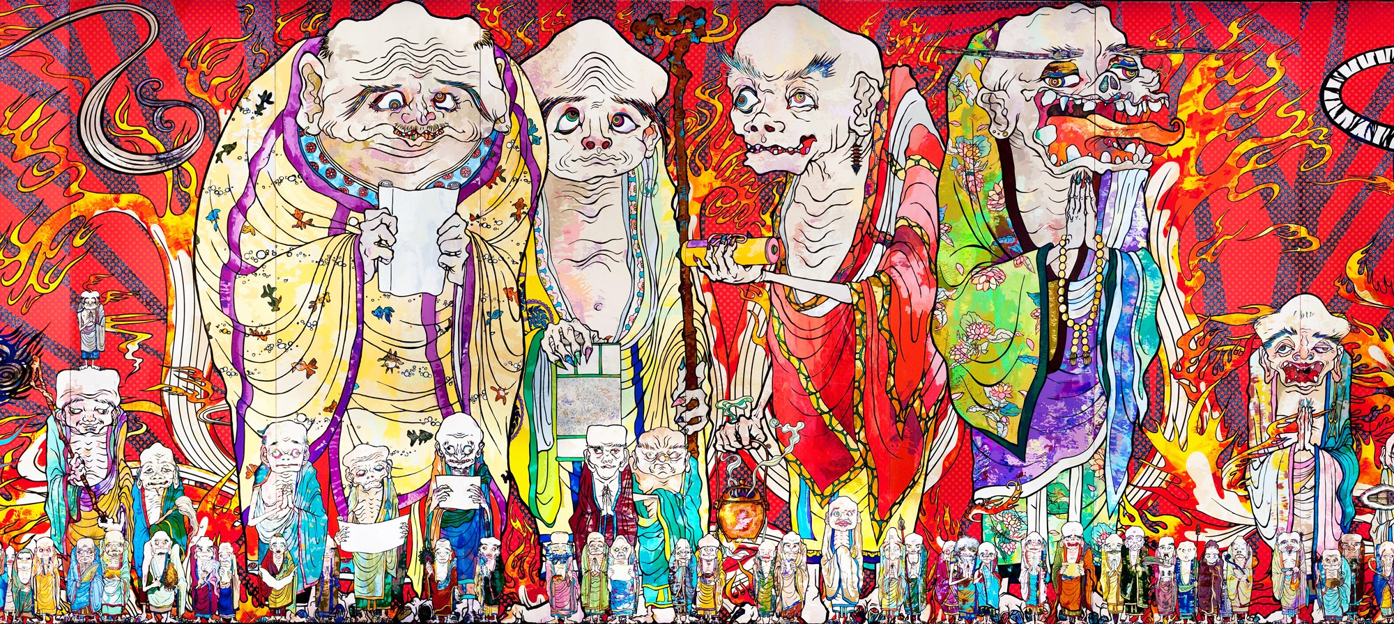
Takashi Murakami Japan 1962

Described as “the Warhol of Japan”, Murakami is known for his blending of high and low arts – synthesising fine art and popular culture, especially through his use of graphic, colourful cartoon style. He is primarily a sculptor and painter. His works are bright, bold and frequently feature images such as smiling flowers, eyes, skulls and mushrooms. He also uses traditional Japanese imagery. They could be described as a fusion of psychedelia and pop-art, hence the comparison with Warhol. To me, there is a distinct Kawaii influence – particularly the ‘cute’ flowers that he favours. Although I’m drawn to the bright-colours and imagery, I can imagine a Murakami exhibition would be migraine-inducing. I chose to research this artist simply because he challenges the idea of ‘art’, but it’s safe to say I’m not sure quite what to think of his work.

http://www.japantimes.co.jp/wp-content/uploads/2015/11/p7-tokyo-murakami-a-20151104.jpg

https://www.gagosian.com/__data/8cc83ec331555abf6f62b7e4ee09d0d4.jpg

https://s-media-cache-ak0.pinimg.com/736x/cf/f3/18/cff318338f24c3e21f4d61a475adfac2.jpg

Timorous Beasties Alistair McAuley/Paul Simmons Scotland 1990

Timorous Beasties is a design studio established in 1990 in Glasgow, Scotland by Alistair McAuley and Paul Simmonds. They specialise in taking traditional motifs and giving them a modern, edgy twist. Their Glasgow Toile reverses the pastoral images of toiles du Jouy, turning it into an urban landscape with high-rise tower blocks, an aeroplane flying over a church and a drug addict. Their ‘Ruskin’ collection features repeating patterns of birds, flowers and other lavishly rendered representations of the natural world. The ‘Thistle’ collection utilises an iconic symbol of Scotland. The designers acknowledge the influence of William Morris on some of their work.

http://www.timorousbeasties.com/mediaLibrary/images/english/227034.jpg

http://www.timorousbeasties.com/mediaLibrary/images/english/4027824.jpg

http://www.timorousbeasties.com/shop/fabric/40/bamboo-lace-fabric/


http://www.scottish-gallery.co.uk/artist/elizabeth_blackadder

http://www.exploreart.co.uk/artist_display.asp?SF1=sort_name&ST1=BLACKADDERDAMEELIZABETH

http://www.vam.ac.uk/page/w/william-morris/

https://www.artsy.net/artist/takashi-murakami

www.timorousbeasties.com

https://www.theguardian.com/artanddesign/2007/feb/08/design.britishidentity
What is Drawing?

To me, drawing is creating an image using a tool and a medium. From a Neolithic person using clay and a stick to a modern-day artist with their digital stylus on a tablet or smartphone, I believe there has to be a physical connection between the artist and the image. Although a bundle of sticks can produce a drawing, I don’t believe that you can ‘draw’ with a camera – the image captured is instant, gone in a second. Drawing requires interpretation and emotional involvement – the process is as important as the subject matter.

There are so many forms of drawing – fine art to manga and comic books, commercial to the scribbling of a young child.

I would like to use a more experimental approach to this project – to not get too hung up on fine details and ‘perfect’ drawings. I’m particularly interested in the concept of continuous line – I find it strangely appealing. I would also like to explore digital art as a more-or-less new medium to myself.


Exercise 1.6 Detail and definition

The brief for this exercise was to look at the archive textiles up close to capture their minute details and finest qualities.

I wanted to keep the drawings to a similar scale and use the same media to represent the different details. I chose to focus on fastenings, linings and any imperfections I could find inside the textiles.

IMG_2984

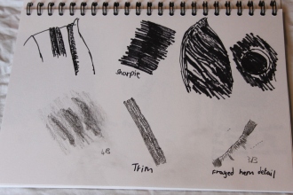
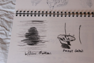
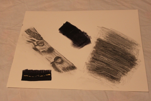
The first set of drawings was from the satin coat. I used charcoal to interpret the detail of the buttons and the collar trim, which I think shows well the definition within the trim and highlights the contrasts of the satin. I used ink and marker pen to show the frayed edge and stitch detail in the hem. The dry brush technique gives an impression of the loose threads. I went back to the idea of lifting out from a darker background to depict the shattered lining fabric. I overlaid black pastel with a grey to try to give this effect. This worked slightly better than in my original attempt, but it still needs refining to really show the definition. The last drawing was a happy accident – I was folding the coat to put it away, and the back inside hem unfolded, revealing the contrast between the stitched edge and the original hand stitching that had secured the lining. I went back to my dry-brushed ink to show the frayed folded edge, then used pastels to highlight the machine stitched hem and hand-stitches.

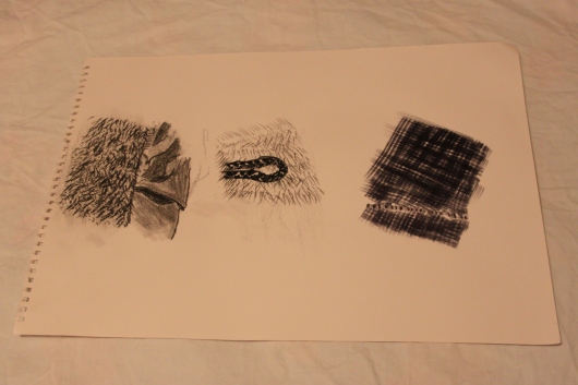
IMG_2985

The second set of drawings is taken from the fur coat. I used charcoal again to show the different textures of the shiny lining and fur pile. The texture of the paper was intended to suggest a weave for the satin and provided a base for the pile section. I focused on one of the fastenings for the next drawing. This was done in pastel using a series of short repetitive marks to suggest the fur. I used thick marks to suggest the herringbone effect of the finish on the fastening. The last drawing is of the satin lining showing a thread that has pulled, leaving a line of small holes. I used ink and a large flat brush to suggest the weave of the fabric, but it hasn’t come out as intended. The line of pen marks work better to suggest the tiny, regular holes.

IMG_2986

The third sheet of drawings is from the chenille coat. This is the most experimental of the three, which I’m moderately happy with overall. The first drawing uses short marks in charcoal to suggest highlights and shadows on the surface of the lining. I also attempted to depict small holes where the lining has pulled away from the seam stiches, but I think the charcoal lacks the definition needed for this. Darker versions of these lines suggest the raised chenille pattern of the outer fabric. The next drawing was made using continuous line and a marker pen to depict a button and a small area of the pattern. This interpretation has little technical merit, but I find the idea curiously appealing. The last drawing is a bit of a miss. I was attempting to depict an area where the lining has split away from the main fabric, revealing the raw edges and wrong side of the outer fabric. There are also some loose threads to add interest. I used ink and a large brush to suggest the threads and areas of contrast, but this just doesn’t convey the idea I was trying to get across.

This is definitely an exercise of contrasts – it started off well, but by the final drawing, I felt like my brain was fried. I think I’d lost sight of what I was trying to interpret in favour of ever more experimental ideas. I can’t help a nagging sense of needing to do more with this exercise, and I will come back to it before submitting for final assessment.


Research Point 1. Wabi-Sabi

Wabi-sabi is the art of finding beauty in imperfection and profundity in earthiness, of revering authenticity above all. (Robyn Griggs Lawrence, Natural Home May-June 2001)

Wabi-sabi is a deeply ingrained concept within Japanese culture. It emerged in the 15th century in reaction to the overarching taste for lavish, rich materials and ornamentation. There is no direct translation for the idea – it so much a part of society, that the concept is difficult to explain to Westerners.

Essentially, wabi-sabi is about the aged, understated and simple things – cracks, crevices, rot and the marks of time, use and weather, an abandoned building or the bleak beauty of a grey December beach.

I hadn’t heard of this concept until now, but I think it’s something that I’m instinctively drawn to – I feel like I understand what the author is saying without her needing to explain in detail. I’ve always felt at home in old churchyards with faded and lichen-covered headstones, and much prefer abandoned beaches in the depths of winter, with just the waves and seabirds for company.

In relation to my artistic practise, the concept could be a reminder to ease up on myself and not look to produce ‘perfect’ artwork all the time. There is also the suggestion to explore imperfection as an inspiration – moth-holes in fabric, woodworm in old wood, a broken shell perhaps. I’m not sure I can quite put it into words yet, but I can absolutely see how wabi-sabi applies to the theme of this project.

http://www.utne.com/mind-and-body/wabi-sabi.aspx


Exercise 1.5 Collage and creases

The brief for this exercise was to depict the archive textiles using two-dimensional collage to explore form, shape, drape, volume and three-dimensional qualities.

I’d had enough of sketchbooks by this point and decided to just get stuck in and see where the papers took me. Working directly with materials is much more in my comfort zone and I find it lends itself to an instinctual and spontaneous approach. With both collages I decided that I wanted to colour the background paper to fit in with the overall palette I wanted to portray. I felt that pure white paper would break up the harmony I was looking for.

IMG_2982

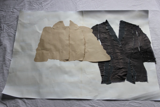
The first collage is an exploration of the simplified shapes of the fur and satin coats. I joined four pieces of cartridge paper together to make an A1 background, then stained it with cold tea to give an aged effect. I painted tracing paper with ink to give the impression of the slightly shiny surface. I used the paper inked side down to suggest the highlights and drape of the coat. I had some black kraft paper that lent itself well to the impression of the trim. I used more kraft paper to represent the fur coat, trimming the edges of the body to suggest the fur. I think this collage gives a good sense of the scale and overall silhouette of each garment. As I was creating the shapes, I almost got a sense of the pattern pieces that would have been used to make the original fabrics into garments. For me, it links back to the story element from exercise 1.2.

IMG_2983

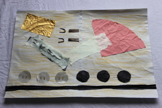
The second collage is very much an abstracted interpretation of the brief, which was deliberate – I wanted to explore the basic elements of the textiles. I started off using pastel to colour two sheets of newsprint, then glued those onto another sheet of paper. Part of the brief states “You’ll apply your papers flat onto a base paper to compose your drawings”, this lead me off on another path – if I’m applying the paper, what about the things that were applied to the textiles to make them into garments? The blocks of paper are intended to represent the linings of the garments – creased to suggest the age and the fact they’ve been worn. The yellow handmade paper over black is intended to suggest the threads and holes in the damaged lining of the black jacket. I then moved on to the fastenings of the garments – hooks and eyes for the fur coat, buttons for the chenille and black coats. The black buttons are slightly raised to show the roundness and the beige buttons are secured using tissue paper twisted and coloured to make a ‘thread’. I also manipulated some inked tissue paper to suggest the raised trim of the black jacket.

The colours are not perfect on either collage, but I feel they blend well together.

I enjoyed this exercise much more than the previous two – I find it so much easier to experiment with actual materials. It was also a relief to work with colour once again!


Exercise 1.4 Lines and edges

The aim of this exercise was to develop observational and recording skills, focussing on using different qualities of line to depict the textiles. It also aimed to build an experimental approach to drawing.

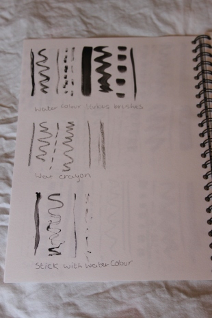
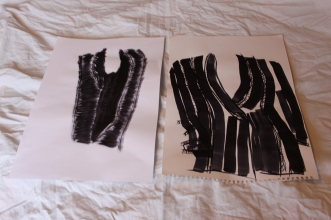
As suggested in the brief, I used larger sheets of paper to allow more room for expression, although they all ended up being A3. I used watercolour and paintbrushes in addition to ink, pen, pencil, charcoal and pastel. Although this exercise is intended to encourage experimentation, I stuck to tools that allow a degree of control over the resultant marks.

IMG_2963IMG_2965IMG_2964

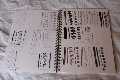
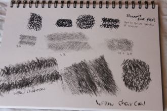
As before, I made a range of lines in my sketchbook using various media and tools as an exploration of their different qualities and effects.

The drawings

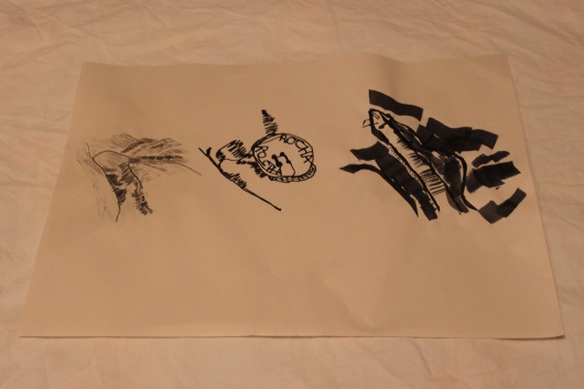
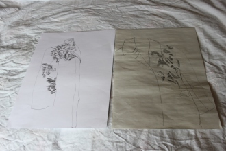
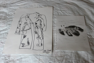
IMG_2979IMG_2980The first drawing was an exercise in continuous line. This was a hard one as I felt like I didn’t have a clue what I was doing. As soon as I started, I realised the scale and proportions were all wrong, but I kept going until I had something I was vaguely happy with. The second picture was an exercise in using line to represent the shadows and features of the coat. Again, I found it hard to get the scale right, but I think the horizontal lines give a good sense of the weave. The third study I did with my eyes closed, using a continuous line. This is by far the least polished of the drawings, but I actually quite like it. I could ‘see’ the coat quite clearly in my mind, but my hand drew something quite different. The bold marker pen lends itself well to the somewhat random line. The final piece was ‘drawn’ with watercolour and a paintbrush with a charcoal background to give some context. I’m not sure I see this as drawing exactly, but the lines are interesting. They ended up being thicker than intended, but I think the contrast in tone gives a good impression of the pattern in the coat.
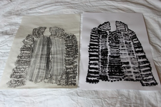
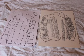
IMG_2978IMG_2977The first sheet was an attempt at a fuzzy line to show the furriness of the coat, which works well, but it’s difficult to give any impression of drape at this stage. I also used the charcoal flat to portray the bands of the jacket front, but this loses the overall impression, so perhaps I should have stuck to the fuzzy line here. The next drawing was an attempt at using a bold dotted line to show the coat. This ended up more as mark-making rather than line and I found myself wondering where mark-making ends and line begins. The third drawing was a quick observation using a marker pen and both hands (For the record, I am left-handed). I think it gives a good sense of the weight of the coat. The final drawing used pastel and I had my eyes closed. It’s not as controlled as I would have liked, but I’ve caught the overall shape and parts of the jacket.
IMG_2973

I was running out of ideas at this point, so these two observations are pretty weak. They both use ink and brushes. With the first drawing I aimed to capture the entire coat just using a contrast of thick and thin lines. I think it has a slightly Cubist impression (with many apologies to Picasso et al.), but I don’t think it really conveys any particular qualities of the jacket. The second drawing aimed to build on the first, but using a more distorted line. It does sort of give a sense of the weave of the fabric, but I don’t know what I was really trying to say here.

This was an exercise of contrasts for me; although I did enjoy the freedom to experiment, it feels odd to be showing these drawings to anyone other than myself. Somehow, they don’t feel ‘good enough’ to be shared despite only being explorations.


Exercise 1.3 Making Marks

The brief for this exercise was to observe, analyse and record the textile items from Exercise 1.1 using drawing and mark-making onto paper.

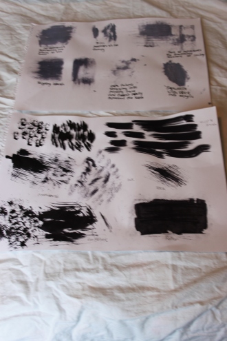
I used a variety of paper types (newsprint, cartridge, acrylic and watercolour) and sizes (A4 to A2). I used a range of media (ink, acrylic, charcoal, pencil, marker pen, pastel) and tools (stick, sponge, fur fabric, crepe fabric, roller, large brush, toothbrush) to create marks and drawings.

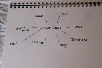
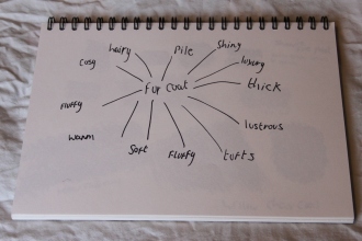
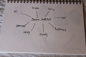
 To begin with, I made mind-maps of qualities and properties related to my items, which I would later use to inspire my mark-making.

IMG_2954IMG_2956IMG_2960

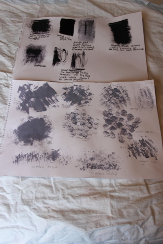
Next, I experimented in my sketchbook and on larger sheets to produce a range of marks representing the qualities from my mind-maps.

 IMG_2955IMG_2957IMG_2958IMG_2959IMG_2962

IMG_2967IMG_2966

The Drawings

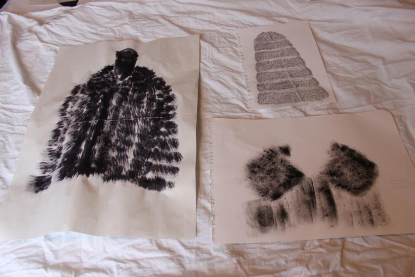
IMG_2969

The first piece was produced using a large stencil brush and ink, flicking the brush to show the pile. The second piece is done in acrylic paint with a sponged background. The pile was ‘printed’ using fur fabric. My intention was to show the alternating bands of hair length within the coat. The third piece is in pencil of a mixture of softness. I created a background by using the flat of the lead to represent the denser undercoat, then laid short marks over the top to represent the longer guard hairs. The main properties I wanted to portray were ‘thick’, ‘soft’ and fluffy. The first piece shows ‘thick’ and ‘fluffy’ through the weight of the brush strokes, but perhaps less of the ‘soft’ quality as there is little difference in tone. The second piece gives a sense of softness with the diffuse marks from the sponge and fur fabric, but lacks weight. This might have been built on by using more paint, but I think the softness would have been lost in this case. I think the third piece best represents the qualities mentioned above. I like the level of control that pencils give and this is the medium I am most confident with, so this probably contributes to its success.

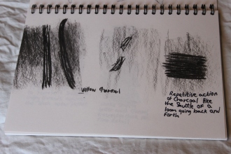
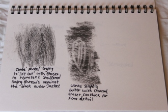
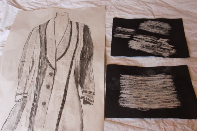
IMG_2971The first study of the satin jacket was intended to represent the lustre of the silk fabric. I used charcoal to show the contrast between the shadows and highlights in an attempt to represent this. Although the fabric appears smooth at first glance, there is a hint of the weave when you look closer, so I used the charcoal on its side to pick up texture from a piece of textured material. It was hard to show the age of the jacket on a large jacket, so I decided to look inside at the damaged lining. My first idea was to use pastel to represent the weave of the lining against the jacket. I attempted to remove layers of pastel with an eraser to show how the holes in the lining revealed the underside of the jacket, but it wasn’t very successful. The idea of ‘lifting’ out is something I plan to explore further in the future. I had another go at drawing the lining, this time simply drawing the lines as if they were the frayed threads. This works better than the previous attempt, but needs further development to really convey the effect I had in mind.
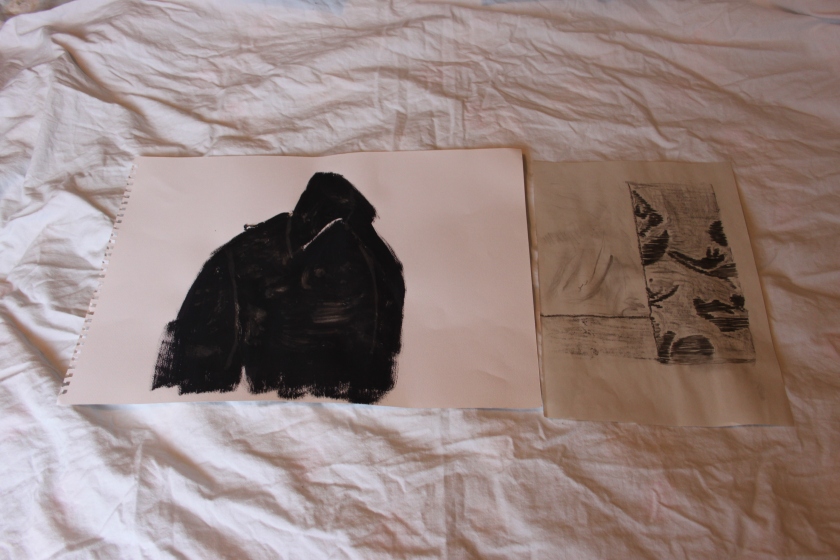
IMG_2972The two drawings of the chenille coat are least successful at portraying the qualities in the mind map. I found the lines between drawing and mark-making were really blurring here, and although I think this was part of the exercise, it didn’t work for me. I’m least happy with the first drawing. Again, I was attempting to ‘lift out’ the woven motifs of the coat, this time using an old toothbrush dipped in household bleach over acrylic paint. I’m not sure if the bleach wasn’t strong enough or the paint was too dry, but it doesn’t work at this point. Again, this is something to explore in the future. The second piece is much more successful. This is in conté pastel and charcoal. I was attempting to portray the structure and drape of the outer fabric contrasting with the soft, shiny lining. Again, I believe that this this comes down to my own confidence with the particular mediums – charcoal and pastel can be used in a similar way to pencils and allow for more control.

It’s clear to me that I need to develop more confidence in experimenting with different media and techniques. I found it quite liberating just to make marks with certain qualities in mind on my experimental sheets, but as soon as I started to draw the textiles in question, I seemed to shrink back to this idea of having to ‘render’ the objects instead of the qualities. I do think there is some improvement from the very first assignment, so perhaps there’s hope yet.


Selecting and identifying, Exercise 1.2 Substance and story

IMG_2933

Edwardian jacket

Substance

1. What is the textile made from?

Black silk satin outer, woven silk lining. There is no label to indicate the fibres. I have used observational skills and burn testing to identify the fibres. Silk should be hand washed in mild detergent in lukewarm water. It should be rolled in a towel to remove excess water, then laid flat to dry.

2. What methods have been used in its production?

The fabric is finely woven by machine. The jacket has been constructed using machine and hand-sewing. The collar has been stabilised with hand-stitched interfacing. The jacket has been finished with a lining and machine and hand-finished buttonholes.

IMG_2938IMG_2942

3. Where is the textile from?

As silk was produced in Japan, China, India, Italy and the United Kingdom at the time the jacket was supposed to have been made, it is hard to know for sure exactly where it came from. I would make an educated guess that the fabric was produced in the United Kingdom, possibly in Macclesfield.

4. What problems have you encountered in trying to find out this information?

Traceability in textiles is important when considering sustainable and ethical practices. If the supply chain can be traced from producer to consumer, it is possible to know how well a garment complies with’ best practice’, allowing consumers and suppliers to make choices based on their own values and needs.

I am missing information regarding where the fabric and jacket were made and by whom. I could contact the clothing seller where I bought the jacket to see if they have any further information or perhaps a museum to see if they could provide further insights.

Story

1. What other visual indications can you glean from closely examining the textile samples? If the textile has been made into a product, what can you learn from further visual examination?

The jacket is worn in places, with pulled threads and wear on the hem. The silk lining has shattered, probably due to age and wear. Overall, the garment is well-made and still wearable, with robust seams and no obvious holes. I was told by the seller that the jacket is Edwardian. The style, fabrics and construction seem to support this statement. I cannot find any evidence of patina, repair or alterations.

IMG_2945IMG_2947IMG_2946


I would guess that the jacket was made by a dress-maker for a middle-class woman, perhaps the wife of a banker or factory owner. Or perhaps it was produced by a dress-maker to wear herself.

2. Are there any elements of the design, detail, decoration or construction of the textile sample that indicate a story behind the textile or product?

I cannot see any specific elements that suggest a story, but it is clear the jacket has been made to last. It was most likely made to a specific person’s measurements, so could be considered personalised in this way.

IMG_2931

1950s simulated fur jacket

Substance

1. What is the textile made from?

The fake fur is made from acrylic pile with a woven cotton backing. The lining is labelled as 100% acetate. Both fabrics are machine-made. There is no label, so I have used observation and research to find out what fibres have been used. I could also burn test a small sample of the fibre.

IMG_2950

The fabric should be dry-cleaned or can be cleaned at home with gentle hand-washing in mild detergent. It must not be agitated to avoid matting of the pile. It should be dried on a rack and re-positioned often so there are no marks.

2. What methods have been used in its production?

The fabric may have been produced using sliver knitting, which utilises the same machinery as jersey knitting. As this is fabric simulates natural fur, it is likely that it has been heat set to preshrink it. It will probably have been treated with wire brushes to remove loose hairs, known as ‘tigering’. It may also have been ‘electrofyed’ – a polishing technique where the fabric is combed in both directions with heated grooved cylinders. There are no obvious embellishments or treatments to the surface. The fabric has been made up into a jacket, most likely from a dressmaking pattern.

3. Where is the textile from?

There is no label, so it is not possible to know for sure where the fabric or garment was made. The original acrylic fibres would have been synthesised from chemicals in a factory, and it would also have been woven in a factory.

4. What problems have you encountered in trying to find out this information?

It is fairly easy to find out general methods of production for this item, but not the history of this specific item.

Story

1. What other visual indications can you glean from closely examining the textile samples? If the textile has been made into a product, what can you learn from further visual examination?

The jacket is in very good condition, there is no damage and there do not appear to be any alterations or repairs, although it does have a slight musty smell. It seems to have well-looked after, perhaps kept for ‘best’. The style suggests it is from the 1950s, which is also what the original seller told me.

I would guess that it was made by a dressmaker or a skilled home sewer. I imagine it was kept for special occasions or ‘Sunday best’. I wore it myself for a March wedding a few years ago.

2. Are there any elements of the design, detail, decoration or construction of the textile sample that indicate a story behind the textile or product?

Other than presumably being made to fit the original owner, the jacket does not have any specific features that suggest a deeper story. It has been made to last in a classic style.

IMG_2929

Rocha.John Rocha chenille coat c.2003

Substance

1. What is the textile made from?

The textile is made from viscose, polyester, cotton and acrylic. The lining is acetate. This information is found on the manufacturer’s label. The fabric should be dry-cleaned, according to the label.

IMG_2953

2. What methods have been used in its production?

The fabric has been woven by machine. The pattern has been woven with a chenille fibre to produce a raised area.

3. Where is the textile from?

The label lists the garment as being manufactured in Hong Kong. Given that China is one of the largest producers of textiles in the world today, it is highly likely that the fibres were processed there too.

4. What problems have you encountered in trying to find out this information?

Most of the information about this item is readily available from its label. I could contact the design house for further information.

Story

1. What other visual indications can you glean from closely examining the textile samples? If the textile has been made into a product, what can you learn from further visual examination?

The coat shows areas of wear, with loose buttons and the seam of the lining has split. It has been worn on a regular basis. Overall, it is a sturdy item. I bought the coat new in 2003, so it is about thirteen years old. It has had buttons re-sewn several times.

IMG_2951IMG_2952

2. Are there any elements of the design, detail, decoration or construction of the textile sample that indicate a story behind the textile or product?

Although the coat was made for a spring/summer fashion collection for Debenhams, its construction suggests it would last for a long time, perhaps to become a wardrobe staple for its owner. I certainly dig it out every Spring and Autumn.

Nostalgia

It is possible to build stories of the previous wearers of these textiles, but without more specific information it is only a guess based on my existing knowledge and research.

I do feel some nostalgia for all three pieces – the silk and fake fur jackets hark back to times of elegance and glamour, when most women aspired to look well-turned out wherever possible and mostly had clothes made by or for themselves. They were both made a long time before I was born, but wearing them lends a sense of their history to me. The chenille coat is modern and mass-produced, but is building its own story as I wear it.

I didn’t choose these items specifically with nostalgia in mind – it was more that I wanted to represent their visual qualities. Though I didn’t inherit the older coats, they do represent my heritage in a way as they are both handmade. My own mother made or re-fashioned clothes for the family, a skill she learnt from one of her grandmothers and also passed on to me.


Selecting and Identifying, Exercise 1.1 The Archive

The brief for this exercise was to locate an accessible archive that contains textiles and choose three pieces to study.

 Although there are at least four textile archives near to me, it proved very difficult to secure an appointment within the timeframe given for part one of the project, so I decided to take a look around my home for suitable textiles. The brief suggested that ‘an archive needn’t be a formally documented collection’, – I had a bit of a brainwave when I thought of my ‘collection’ of pre-1980s clothing. I say ‘collection’, more items bunged on a clothing rail, stuffed into suitcases and about as far away from formally documented as you can get. Still, even the Victoria & Albert Museum had to start somewhere, I guess.

 I spent some time deciding what to study. 1970s synthetic dresses in bold, bright prints? Printed floral cottons from my dressmaking hoard? In the end I chose three coats from different time periods. The items I picked all have interesting design features and some history attached to them – I wanted to have a balance between the two aspects. I have tried to present the items as they might appear if displayed in a museum.

IMG_2933

Satin jacket c.1901-1910


IMG_2931

Simulated mink fur swing jacket c.1950s


IMG_2929

Chenille Rocha John Rocha coat c.2003


What is a Textile? – Part 1, Selecting and Identifying

In my opinion, a textile is a largely flat material that could be used for clothing, protection or decoration. The fabric could be embellished or altered with other materials, for example beads or found objects such as twigs or feathers, but the base would remain a textile.

My own experience of textiles is mainly those of a functional nature – clothing or bedding for example. Even these can range from a simple woven cotton bedsheet to a technical non-woven waterproof jacket made from synthetic materials, or a 1970s polyester printed dress to a waterproof polyester tent.

Textiles can have many stories attached to them. There are those of historical significance such as the Bayeux Tapestry (technically an embroidery, rather than a tapestry), depicting the events leading up to the Norman Conquest of England, or the Turin Shroud – believed by some to be the burial shroud of Jesus Christ. Other items, while not individually significant, tell the stories of the industries that produced them. For example, cotton items produced in the mills of the English Midlands, the Gloucestershire woollen industry or Fair Trade textiles from developing countries.

There can also be items that are deeply important on a personal level – a wedding dress passed down from mother to daughter, a favourite shirt that reminds the wearer of a happy time in their life, perhaps even a child’s comfort blanket. Indeed, there is a popular trend for turning outgrown children’s clothes into memory quilts or soft toys.

Textiles can also be used to tell the story behind social or political issues. ‘Desconocida Unknown Ukjent’ is a textiles installation by the Norwegian artist Lise Bjørne Linnert in which members of the public were invited to hand-sew labels with names of women believed trafficked or murdered in Ciudad Juarez in Mexico. The Craftivism movement, a term coined by writer Betsy Greer, utilises various tactics to raise awareness and protest such issues.

I have ordered the book ‘Strange Material: Storytelling Through Textiles’ by Leanne Prain as further reading.


Response to Tutor Feedback – Assignment 1

Overall, I was pleased with the feedback from my tutor. She said the drawings were good, which helps my confidence and that my level of reflection and evaluation is high. She pointed out that learning log is underdeveloped and this is an area I will need to work on. The process of documenting my work is fairly new to me, but as I progress through the course, this will become more natural and easier.

My artist research related to the project is limited and doesn’t really say what they mean to me – I don’t have a lot of experience in this area. My tutor suggested exploring a wider range of artists to find work that I can relate to. She also gave me some ideas to work around my hang-up of ‘copying’ the work of others, which I have been looking into.

Sketchbooks were another area that needs work – I need to show more development to the final drawings.

My tutor gave me a few points to work on, including researching drawing methods, media and tools. I’ve bought a copy of ‘Expressive Drawing’ by Steve Aimone to help me explore and loosen up my ideas of drawing.


Reflection – Asignment One

Reflection – Introductory Assignment


Demonstration of technical and visual skills – materials, techniques, observational skills, visual awareness, design and compositional skills

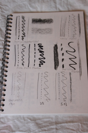
Materials – pencil, charcoal (pencil and pressed stick), fine point marker, rollerball pen. Drawings made on cartridge paper (textured and smooth), acrylic paper, pastel paper.


I found the first assignment somewhat daunting to begin with, not having drawn much for a several years. When I sat down to actually draw, I realised that I’m not quite as rusty as I thought, but there is definite room for improvement on a technical level. I certainly need to work on proportions and the relationships between objects. I also need to work on techniques to show different textures and properties. I tried to remember some of the skills I’ve been taught previously about ‘seeing’ rather than ‘looking’, I felt this improved a little in my later drawings. I used a limited range of materials in this project, perhaps due to my own preconceptions about what constitutes a ‘drawing’ versus mark-making. In future, I’ll look to use a much greater range of techniques and materials to explore briefs. I also need to dedicate more time to preparatory and exploratory sketching to really understand what I’m drawing and thus better communicating my ideas and impressions.


Quality of outcome – content, application of knowledge, presentation of work in a coherent manner, discernment, conceptualisation of thoughts, communication of ideas

I intended to represent the properties of the objects chosen, but I think I got too caught up in more metaphorical concepts such as the necklace representing warmth and sunlight, for example. I went off on a bit of a tangent and somewhat lost the point of the brief. I think this is something that will improve with time as I work through the course and become more used to working with specific ideas. I produced ten sheets of drawings and numbered them in the order of production, my aim being to show my progression of ideas from representational ‘correct’ drawings to loose, more expressive drawings. I think I’ve shown a little ‘freeing up’, but this could definitely be improved upon. I need to move away from the purely representational and the idea of ‘good’ drawing.


Demonstration of creativity – imagination, experimentation, invention, development of a personal voice

My first drawings are very hidebound and I was quite frustrated by my self-perceived lack of skill in ‘correctly’ representing the objects. As I drew more, I realised that point is to loosen up and I began to enjoy the exploration and hopefully that shows through towards the final pieces. I think I just need to produce a lot more sketches and let go of the idea of ‘getting it right’. Although everyone has their own way of interpreting the brief, I don’t think I have a specific personal voice at this point in time. I realise that the course is largely about developing that voice and it’s one of the reasons I signed up. Something I’d particularly like to explore and apply to my practise is the idea of sustainability and how art could be ‘low impact’ in an ecological sense.


Context – reflection, research, critical thinking

Historical research is something I enjoy, particularly that of practical items – I’m interested in the social aspects of how, why, who might have used something. The area of textiles has a diverse and rich history in this respect. I find artistic research much harder – to me it almost lends itself to plagiarism and copying. This is something I will need to get over in the future, although I was actually quite intrigued by some of the Louise Borgeois quotes that I came across – I think I’d like to explore her work more.

I’ve kept a blog in the past, but the idea of a learning log is new to me. The transition from something very personal to more academic will be an interesting one. Getting to grips with the platform is also proving a challenge at the moment, but will come with time.

I’m looking forward to getting out and exploring galleries and art from a more critical point of view. I’m very aware of what I do and don’t like, but it will be interesting to investigate why, and also challenge my preconceptions.


Design a site like this with WordPress.com
Get started