The brief for this exercise was to observe, analyse and record the textile items from Exercise 1.1 using drawing and mark-making onto paper.
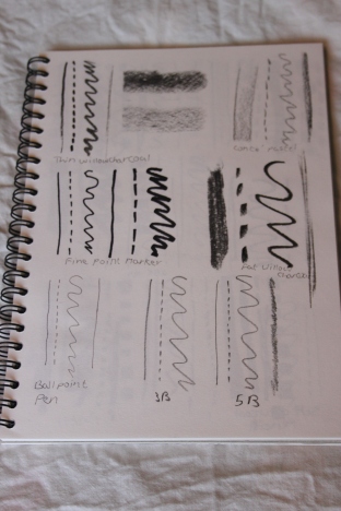
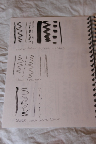
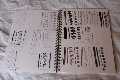
I used a variety of paper types (newsprint, cartridge, acrylic and watercolour) and sizes (A4 to A2). I used a range of media (ink, acrylic, charcoal, pencil, marker pen, pastel) and tools (stick, sponge, fur fabric, crepe fabric, roller, large brush, toothbrush) to create marks and drawings.
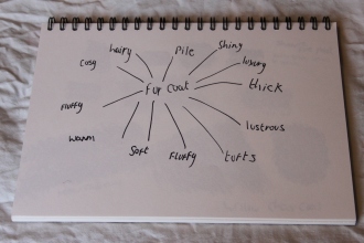
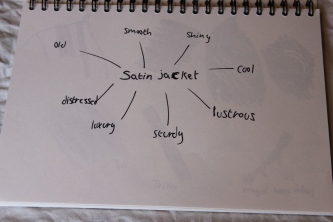
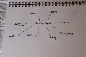
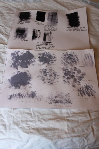
To begin with, I made mind-maps of qualities and properties related to my items, which I would later use to inspire my mark-making.
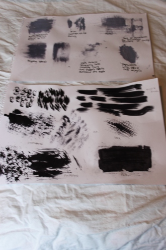
Next, I experimented in my sketchbook and on larger sheets to produce a range of marks representing the qualities from my mind-maps.
The Drawings
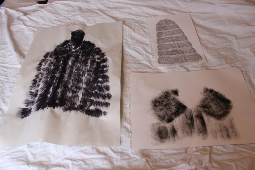
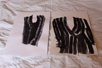
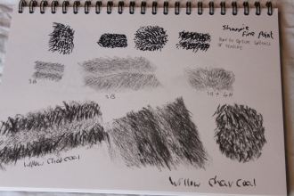
The first piece was produced using a large stencil brush and ink, flicking the brush to show the pile. The second piece is done in acrylic paint with a sponged background. The pile was ‘printed’ using fur fabric. My intention was to show the alternating bands of hair length within the coat. The third piece is in pencil of a mixture of softness. I created a background by using the flat of the lead to represent the denser undercoat, then laid short marks over the top to represent the longer guard hairs. The main properties I wanted to portray were ‘thick’, ‘soft’ and fluffy. The first piece shows ‘thick’ and ‘fluffy’ through the weight of the brush strokes, but perhaps less of the ‘soft’ quality as there is little difference in tone. The second piece gives a sense of softness with the diffuse marks from the sponge and fur fabric, but lacks weight. This might have been built on by using more paint, but I think the softness would have been lost in this case. I think the third piece best represents the qualities mentioned above. I like the level of control that pencils give and this is the medium I am most confident with, so this probably contributes to its success.
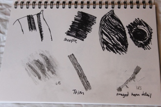
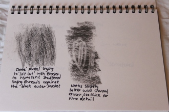
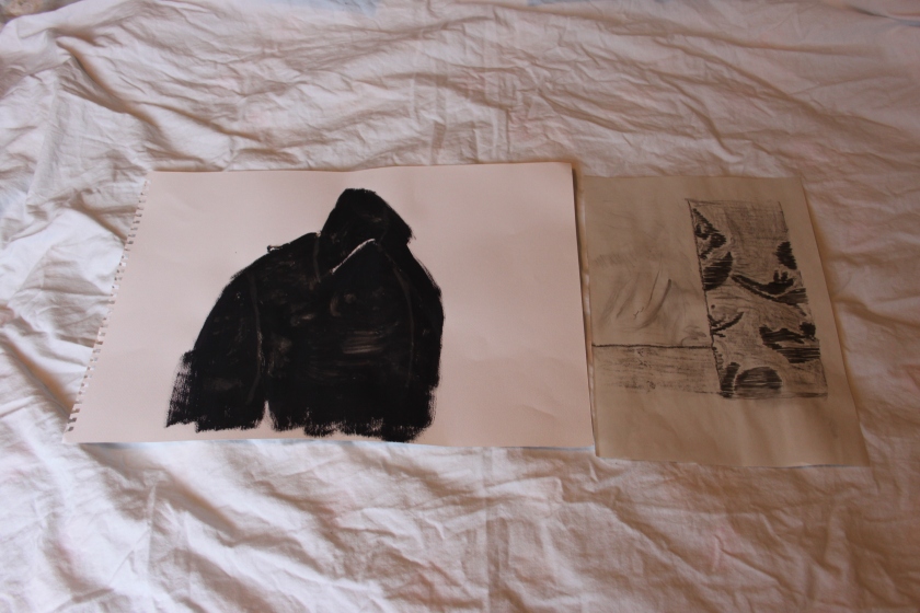
 The first study of the satin jacket was intended to represent the lustre of the silk fabric. I used charcoal to show the contrast between the shadows and highlights in an attempt to represent this. Although the fabric appears smooth at first glance, there is a hint of the weave when you look closer, so I used the charcoal on its side to pick up texture from a piece of textured material. It was hard to show the age of the jacket on a large jacket, so I decided to look inside at the damaged lining. My first idea was to use pastel to represent the weave of the lining against the jacket. I attempted to remove layers of pastel with an eraser to show how the holes in the lining revealed the underside of the jacket, but it wasn’t very successful. The idea of ‘lifting’ out is something I plan to explore further in the future. I had another go at drawing the lining, this time simply drawing the lines as if they were the frayed threads. This works better than the previous attempt, but needs further development to really convey the effect I had in mind.
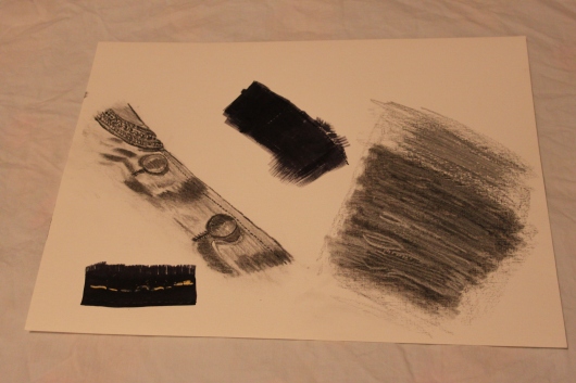
 The two drawings of the chenille coat are least successful at portraying the qualities in the mind map. I found the lines between drawing and mark-making were really blurring here, and although I think this was part of the exercise, it didn’t work for me. I’m least happy with the first drawing. Again, I was attempting to ‘lift out’ the woven motifs of the coat, this time using an old toothbrush dipped in household bleach over acrylic paint. I’m not sure if the bleach wasn’t strong enough or the paint was too dry, but it doesn’t work at this point. Again, this is something to explore in the future. The second piece is much more successful. This is in conté pastel and charcoal. I was attempting to portray the structure and drape of the outer fabric contrasting with the soft, shiny lining. Again, I believe that this this comes down to my own confidence with the particular mediums – charcoal and pastel can be used in a similar way to pencils and allow for more control.
It’s clear to me that I need to develop more confidence in experimenting with different media and techniques. I found it quite liberating just to make marks with certain qualities in mind on my experimental sheets, but as soon as I started to draw the textiles in question, I seemed to shrink back to this idea of having to ‘render’ the objects instead of the qualities. I do think there is some improvement from the very first assignment, so perhaps there’s hope yet.
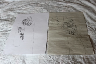
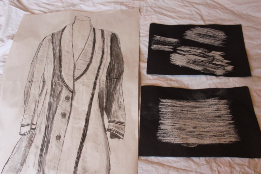
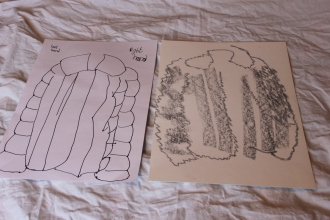
 The first drawing was an exercise in continuous line. This was a hard one as I felt like I didn’t have a clue what I was doing. As soon as I started, I realised the scale and proportions were all wrong, but I kept going until I had something I was vaguely happy with. The second picture was an exercise in using line to represent the shadows and features of the coat. Again, I found it hard to get the scale right, but I think the horizontal lines give a good sense of the weave. The third study I did with my eyes closed, using a continuous line. This is by far the least polished of the drawings, but I actually quite like it. I could ‘see’ the coat quite clearly in my mind, but my hand drew something quite different. The bold marker pen lends itself well to the somewhat random line. The final piece was ‘drawn’ with watercolour and a paintbrush with a charcoal background to give some context. I’m not sure I see this as drawing exactly, but the lines are interesting. They ended up being thicker than intended, but I think the contrast in tone gives a good impression of the pattern in the coat.
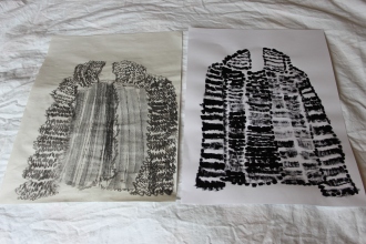
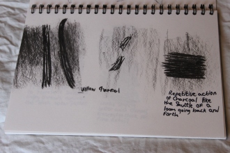
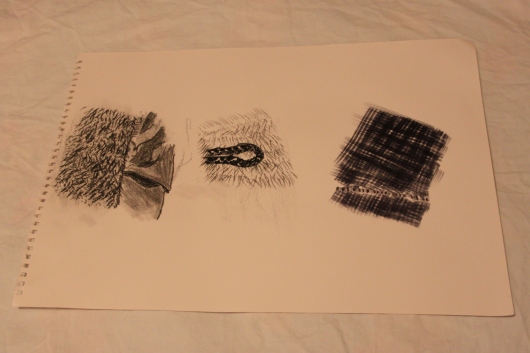
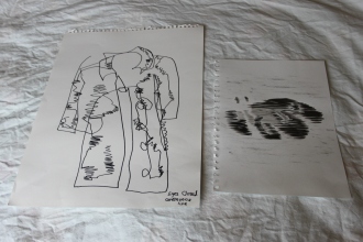
 The first sheet was an attempt at a fuzzy line to show the furriness of the coat, which works well, but it’s difficult to give any impression of drape at this stage. I also used the charcoal flat to portray the bands of the jacket front, but this loses the overall impression, so perhaps I should have stuck to the fuzzy line here. The next drawing was an attempt at using a bold dotted line to show the coat. This ended up more as mark-making rather than line and I found myself wondering where mark-making ends and line begins. The third drawing was a quick observation using a marker pen and both hands (For the record, I am left-handed). I think it gives a good sense of the weight of the coat. The final drawing used pastel and I had my eyes closed. It’s not as controlled as I would have liked, but I’ve caught the overall shape and parts of the jacket.